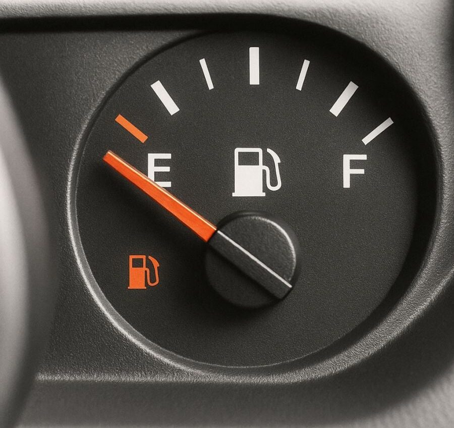
Most drivers have glanced at their dashboard thousands of times without ever noticing one of its most useful features: a tiny arrow sitting beside the fuel pump icon. It doesn’t blink. It doesn’t beep. It doesn’t demand attention. And yet, it quietly solves one of the most common driving annoyances—figuring out which side of the car the gas tank is on.

That small arrow points directly to the side where the fuel door is located. Arrow on the left? Gas cap is on the left. Arrow on the right? You guessed it. No guessing, no awkward repositioning at the pump, no backing up while other drivers wait. In moments of distraction or stress, that little symbol delivers instant clarity.
This wasn’t a random design choice. As people began switching cars more often—rentals, shared vehicles, company fleets, family cars—muscle memory stopped being reliable. What worked in one car failed in the next. Automakers responded with a solution that needed no instructions, no language, and no learning curve. Just a simple visual cue that works everywhere.
Its value becomes obvious when you need it most. You’re low on fuel, running late, or navigating an unfamiliar station. Instead of stepping out to check or trusting a fuzzy memory, you glance down for half a second. Problem solved. That tiny moment of certainty removes friction from an already hectic situation.
What makes the arrow brilliant is how understated it is. It doesn’t interrupt. It doesn’t announce itself. It simply exists, waiting to be noticed. Once you learn what it means, it permanently changes how you refuel. After that, driving a car without it feels oddly inconvenient.
The gas arrow also reflects a larger design philosophy in modern vehicles. Today’s dashboards are filled with subtle cues meant to guide rather than alarm. Temperature warnings appear quietly. Eco indicators encourage smoother driving. Tire pressure alerts stay calm until something truly needs attention. These features reduce problems before they become stressors.